MPA
Architecture Practice
NAMING
STRATEGY
VISUAL IDENTITY
WEBSITE DESIGN
COMMUNICATION
SOCIAL
Mark Pinney Associates is a bespoke design and architecture practice based in London that specialises in high-end luxury. Mark and his well respected group of architects are trusted by premium retail brands, hotels and high net worth individuals around the world.
They have designed iconic aspects of many Apple stores, most of the premium retail stores on Old Bond Street, several top Mayfair restaurants, luxury boutique hotels in New York and a long list of expensive private residences.
Over the last 20 years they’ve worked with some of the world’s highest profile brands but still surprisingly have a very low profile in the world of architecture. Mark asked us to help him reinvent his brand, grow his business and get on the radar of the right people.


Mark had made the decision a long time ago to remove his name and call the company MPA in the belief that all of the associates should be given equal status. We respected this gesture but encouraged him to be brave and put his name back above the door (our research told us that clients wanted a more personal service).


It was not so easy getting Mark to finally agree on a decorative font for his new visual identity (and not the default Arial or Helvetica Neue that all architects usually love to use).


We spent days searching for the right font until we discovered the beautiful Avaunt Stencil Semi Bold - a new bespoke typeface hand cut by a small font foundry in east London, used by several style magazines and books (the ones that we found on Mark’s coffee table).


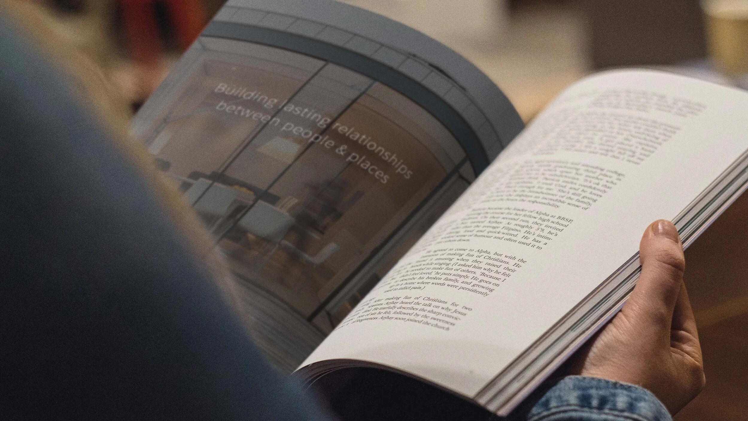
We learned from the brand workshop that Mark really does care about relationships more than anything else. Building long-lasting relationships between people (the clients, consultants, engineers, builders and the end-users of the buildings) and places (the buildings, locations and materials) was the obvious choice for the new brand message.


Architects are famously sceptical of branding, Mark was no different at the start. However, we are quietly confident that he now has a greater appreciation of the value of good branding.

This project was created for Mark Pinney Associates by Stu and the team at BTL.
